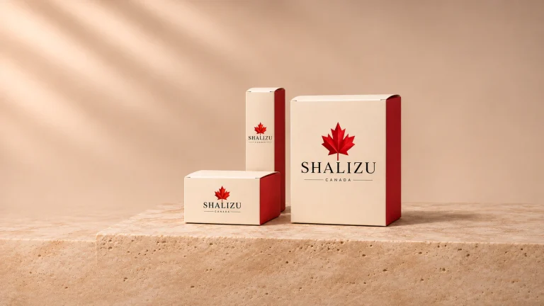
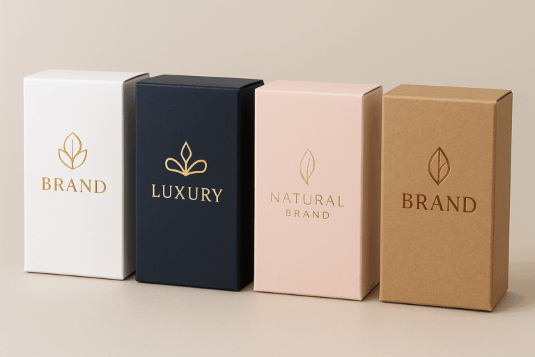
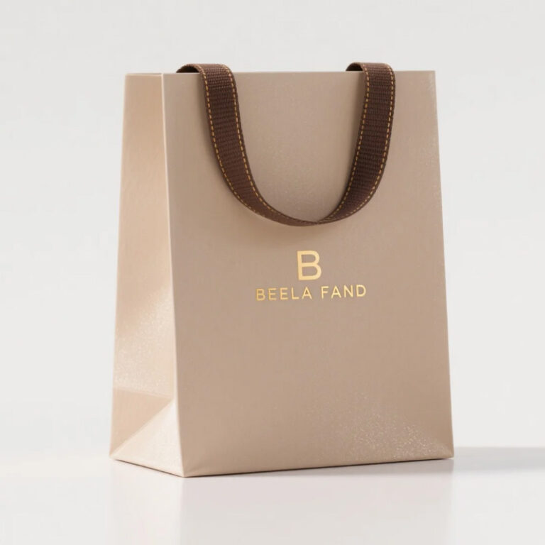
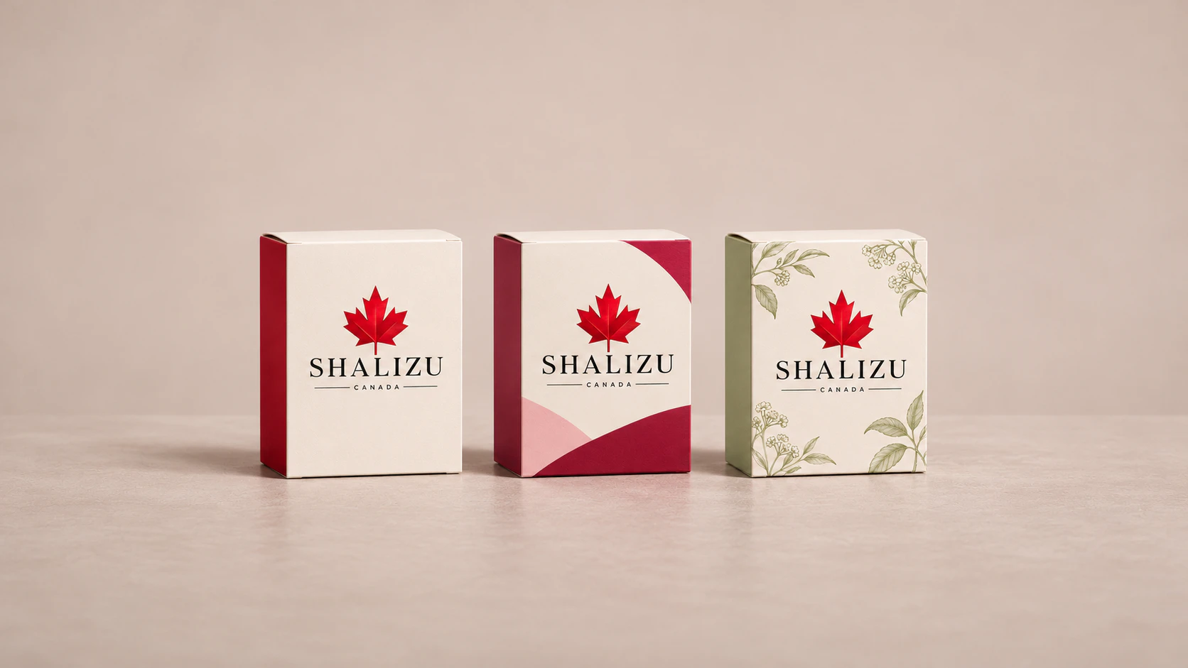
Cosmetic boxes carry meanings that go far beyond a simple bottle or jar sitting quietly on a retail shelf. Imagine a standard face cream formula housed within three completely distinct exterior packaging alternatives. The first option features a clean, matte white finish that creates a calm and understated visual expression. The second variant introduces vibrant color palettes and energetic graphic lines to build a lively atmosphere. A third alternative relies on raw paper textures and earthy brown tones that instantly evoke an old botanical field notebook. Each distinct design direction tells a totally different story about the brand identity, even though the actual product formulation inside remains identical.
This deliberate transformation in packaging design shapes how a consumer builds their very first connection with a physical item before opening it. The tactile feel on the outer surface, the precise color harmony, and the unfolding mechanics combine to reveal the true personality of the maker. Because of this dynamic, the design phase shifts from a routine decorative choice into a strategic decision that communicates company values. Exploring options like a well-crafted Cardboard Box helps teams align exterior presentation with internal product standards across different production batches.
Cosmetic Boxes and First Impression Dynamics
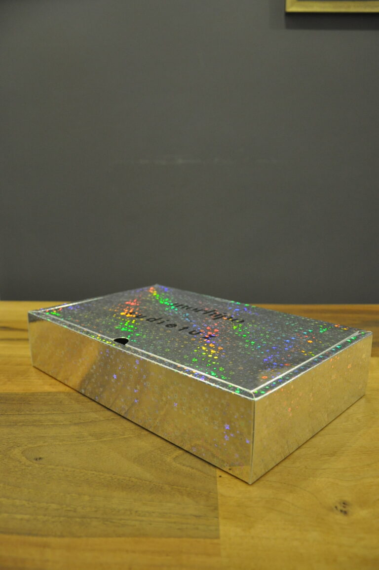
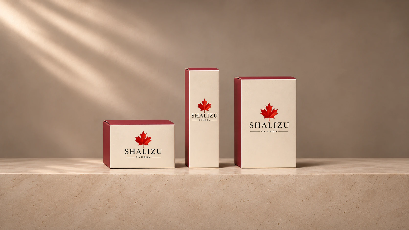
When shoppers scan hundreds of items simultaneously inside a crowded store aisle, their eyes instinctively gravitate toward the packaging structure. This brief moment establishes an immediate mental expectation regarding product quality and overall market positioning. A minimalist container communicates a quiet, clinical professionalism, whereas shiny finishes or metallic accents target a completely different audience looking for high-end glamour. Maintaining alignment between the formulation promise and the visual exterior lays the groundwork for lasting consumer trust.
Beyond visual elements, the tactile feedback experienced upon touching the box surface reinforces this initial evaluation. Smooth varnish details, raised embossed logos, or soft-touch matte cellophanations enrich the sensory journey of holding the merchandise. The packaging acts as a silent yet highly articulate communication channel operating directly within the retail environment without any spoken words.
Psychological Impact of Colors and Materials
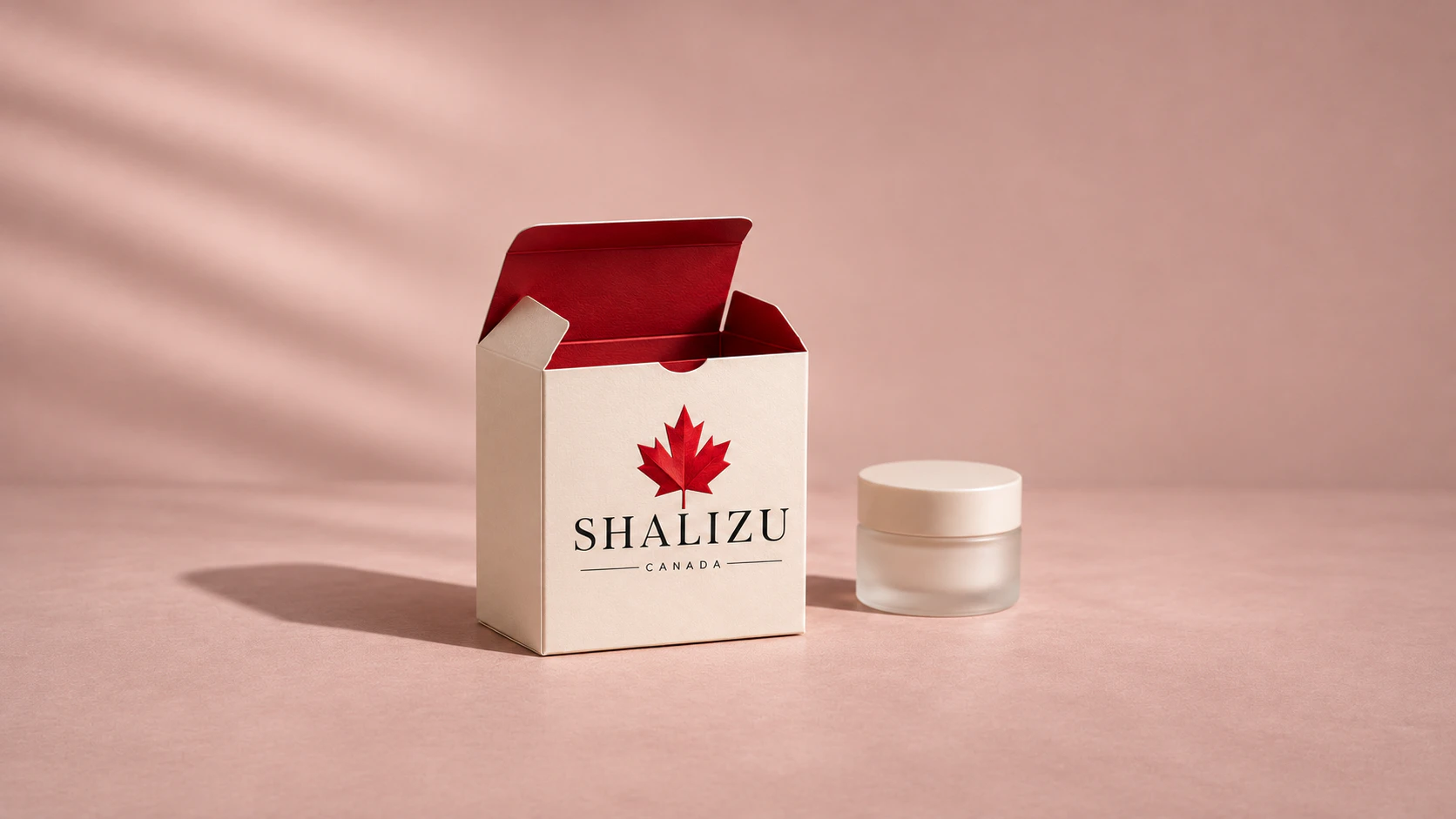
Selecting the right color palette directly influences the perceived mood and emotional resonance of the target audience. Soft pastel shades often suggest natural ingredients and gentle care, while deep jewel tones or reflective metallic surfaces lean toward prestige and luxury. Cardboard calipers and specific paper stocks must harmonize with these visual choices to achieve the desired psychological effect. If a structural paper is chosen without considering its weight and bending stiffness, even an exceptional graphic layout will fail to deliver the expected tactile response.
Buyers frequently associate physical box textures with corporate honesty and attention to detail. Uncoated surfaces derived from recycled paper fibers serve as a straightforward statement for brands focusing on environmental mindfulness. These minute material differences convey manufacturing philosophies clearly and efficiently to anyone picking up the item from the shelf.
The Language of Graphic Placement and Typography
Typography and negative space ratios on a retail container communicate far more than basic regulatory text readability. Fine serif typefaces convey a timeless, classical elegance, whereas bold sans-serif lettering projects a modern and energetic market stance. The deliberate placement of text blocks across panels reveals whether a company prefers minimal simplicity or rich decorative storytelling. Finding the right balance keeps the visual architecture clean and easy to navigate for interested buyers.
Clean layouts that avoid visual clutter and maintain a clear focal point remain memorable in daily retail conditions. Customers should effortlessly locate essential product information without feeling overwhelmed by competing graphical elements. This thoughtful coordination between typography and layout highlights the precise standards maintained throughout the design and pre-press stages.
Functionality and the Opening Experience
No matter how visually striking an exterior presentation appears, the physical opening mechanism remains a crucial component of overall usability. Magnetic closures, sliding trays, or traditional tuck-end flaps can turn the moment of first access into a satisfying ritual. Engaging with these mechanical details deepens the emotional connection between the buyer and the purchased item, elevating the perceived value of the contents.
Functional engineering also requires careful internal layout planning to protect fragile glass bottles or plastic jars during transit. Keeping the primary container securely nested inside prevents movement and preserves that pristine, factory-fresh appearance upon unboxing. This rigorous approach demonstrates dedication to structural integrity and functional reliability.
Sustaining the Style Across Production Batches
A successful packaging concept must remain consistent not just for a seasonal launch, but throughout the ongoing lifecycle of the brand. Adapting to evolving market trends while preserving core visual traits helps secure long-term customer loyalty and brand recognition. Maintaining uniform color consistency, paper quality, and finishing techniques across repeated production runs requires close coordination with manufacturing partners. This steadfast attention to detail secures a stable market presence and preserves high standards over the years.